Biztapp Platform Redesign: How a Vibrant Blue Reignited Engagement

Some design details have been intentionally omitted to respect internal confidentiality policies

My Role — UX designer

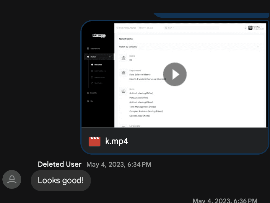
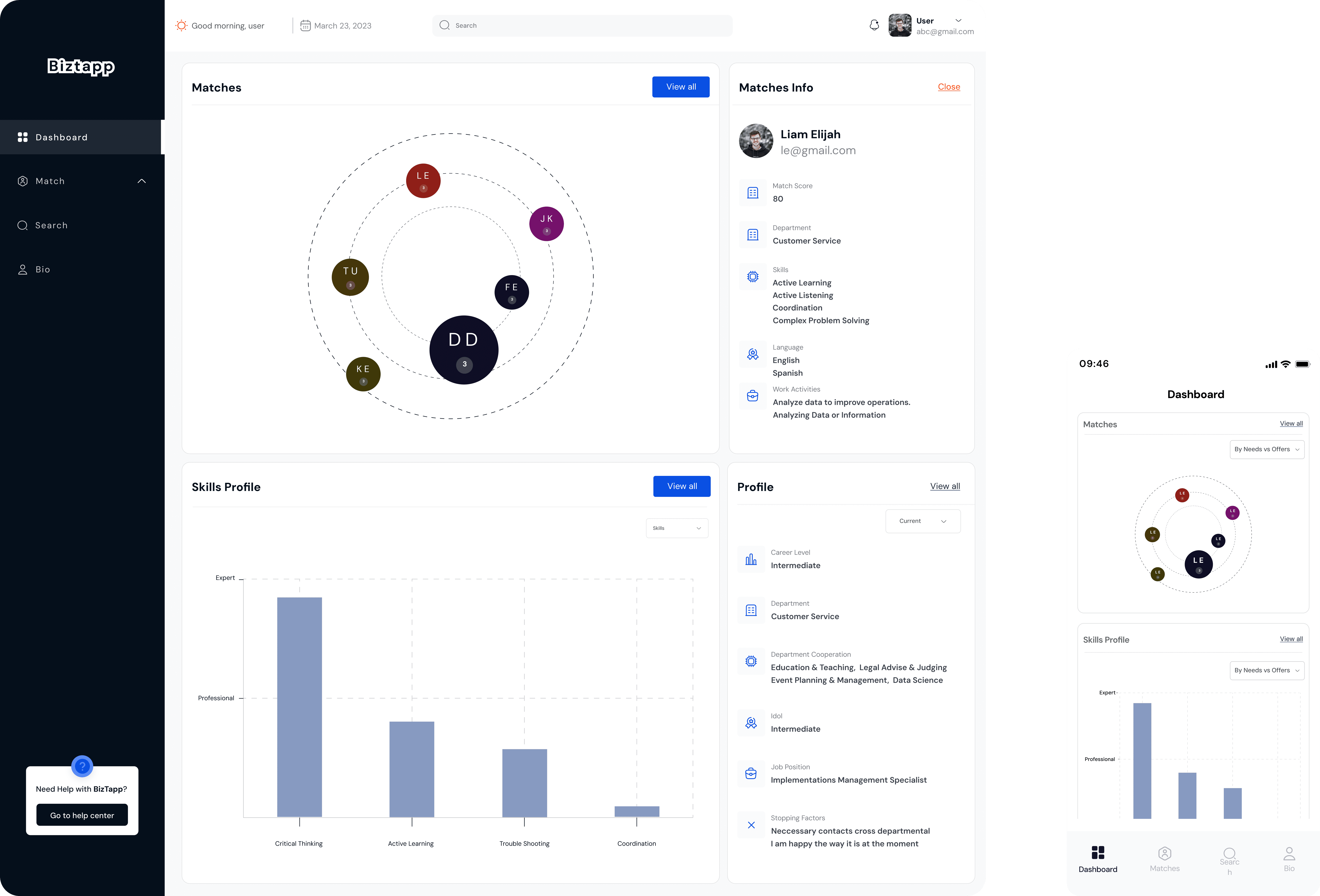
I led the end-to-end redesign of BizTapp, an AI-powered HR platform that matches employee competencies to organizational needs in real time. The goal was to modernize the product experience, clarify its core value, and improve adoption by both HR managers and employees.

BizTapp uses advanced AI models and strict data security, but the platform’s previous interface made these strengths hard to understand and act on. I redesigned the platform to make the product feel more intuitive, trustworthy, and outcome-driven.

The result is a clearer, faster, and more human HR experience, where employees can instantly see opportunities aligned with their skills, and organizations can make better talent decisions with less friction.

The Beginning — When Good Products Don’t Feel Good Enough

When I first joined the Biztapp redesign project, the product already had traction. It had loyal users, a clear value proposition, and strong backend engineering. Yet, something wasn’t working.

Retention was falling, user sessions were short, and engagement metrics hinted that users weren’t connecting emotionally with the interface.

The platform felt like a powerful engine covered by a foggy windshield. everything worked, but visibility was poor.

As a UX Designer, I realized this wasn’t about features, it was about feel.
How users felt while navigating, clicking, and achieving small wins.

Discovery — Listening Before Designing

Before opening Figma, I started by listening, I spent my first week running user interviews, observing session replays, and reviewing support tickets to uncover behavioral patterns.
The result from the survey are as follows

  • Users described the interface as “flat,” “hard to navigate,” and “uninviting”.

  • 80% of new users missed the main CTA on their first visit.


It was a clear signal: our users weren’t confused by the product, they were confused by its presentation.

Before opening Figma, I started by listening, I spent my first week running user interviews, observing session replays, and reviewing support ticketsThe result from the survey are as follows

  • Users described the interface as “flat,” “hard to navigate,” and “uninviting”.

  • 80% of new users missed the main CTA on their first visit.


It was a clear signal: our users weren’t confused by the product, they were confused by its presentation.

The interface just feels… flat. Nothing really stands out

The interface just feels… flat. Nothing really stands out

The interface just feels… flat. Nothing really stands out

Users struggled to find visual anchors. The absence of hierarchy made primary actions blend into the background, indicating a need for stronger contrast and clearer focal points.

Complication

If it feels uninviting, users don’t feel motivated to explore, hurting engagement and retention.
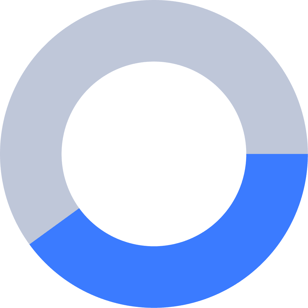
80%

80% of new users didn’t click the primary Call-To-Action during their first session.

Complication

Users are not finding or understanding the CTA, consider visual emphasis, copy changes, or repositioning.

Competitive Audit — Learning from the Best

I conducted a competitive UI audit of products like Airtable, Notion, and Slack, focusing on:

  • Color use: how they used contrast to establish visual hierarchy.

  • Microinteractions: how feedback and motion created trust.

  • Cognitive flow: how users were guided without friction.


The insight?
All successful SaaS platforms use color as communication, not decoration.
Airtable’s greens make actions pop. Slack’s deep purples establish warmth and trust.
Biztapp’s muted blue, however, diluted attention instead of directing it.

Color use of Top SaaS product

Color use of Top SaaS product

Micro-interactions - Primary button states

Micro-interactions - Primary button states

The Turning Point: The Color Conversation

The biggest design decision came down to a single question:


“Should we change our primary color?”


Changing a product’s primary color isn’t cosmetic — it’s cultural.
It affects brand recognition, accessibility, and user perception.

But I believed it was necessary.
Our old blue didn’t meet WCAG contrast standards, it blended with secondary elements, and it visually flattened the hierarchy.

To make the case, I built an evidence-based narrative:

  • Color contrast comparisons between Biztapp and industry leaders.

  • Survey quotes describing the UI as “uninspiring” and “corporate.”


The CEO nodded, We had permission to test a new vibrant azure, modern, energetic, and WCAG-compliant.

COLOR CONTRAST COMPARISON

COLOR CONTRAST COMPARISON

Accesibility and UX Standards
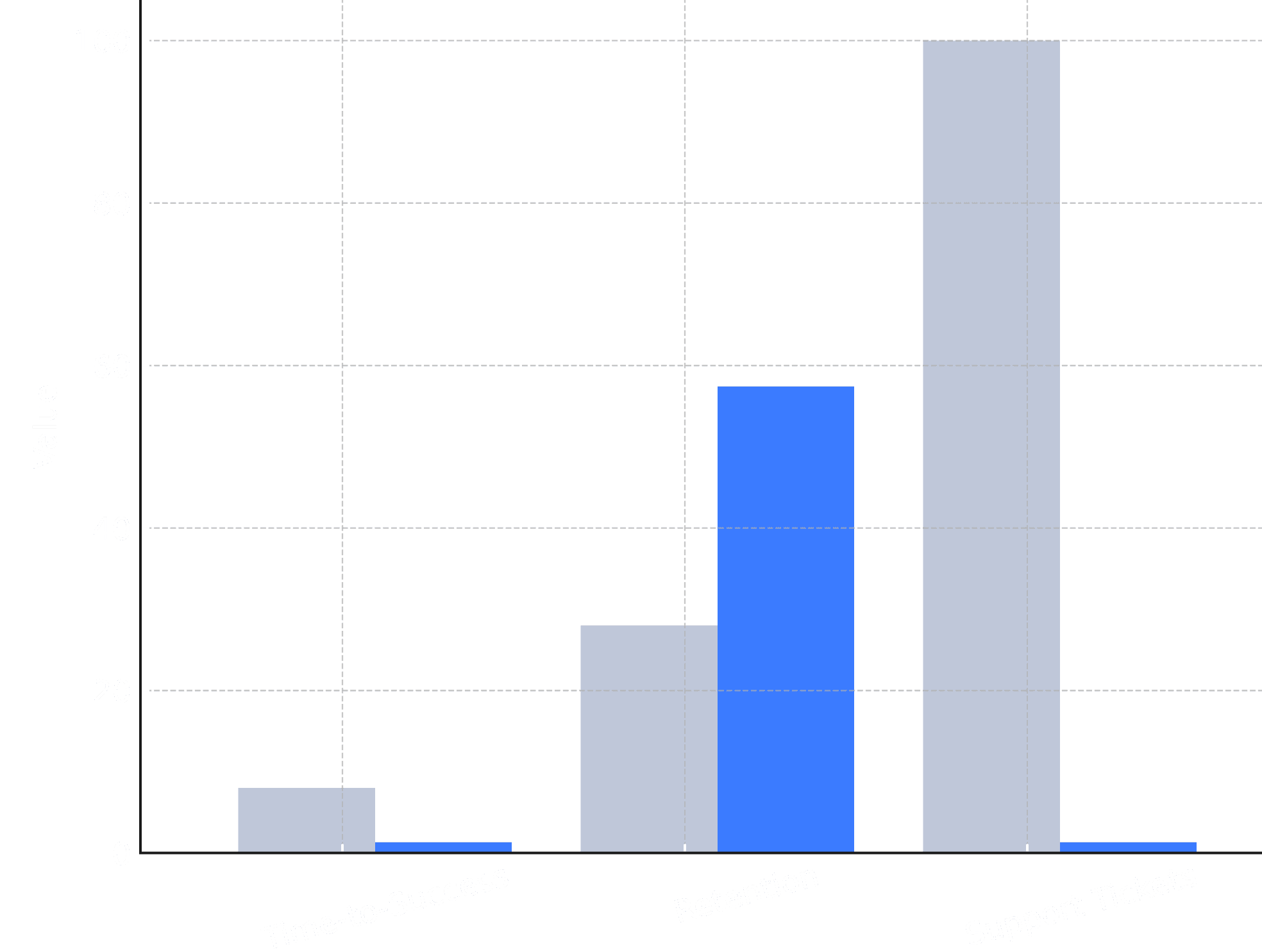
BizTapp UI

BizTapp

2.60

Industry leaders (SAP)

SAP

5.60

Color comparison between BizTapp and SAP

“The interface just feels… flat. Nothing really stands out”

“I don’t know where to click first; everything kind of blends together”

“I don’t know where to click first; everything kind of blends together”

“It looks like every other corporate tool, not bad, just boring”

Survey insights

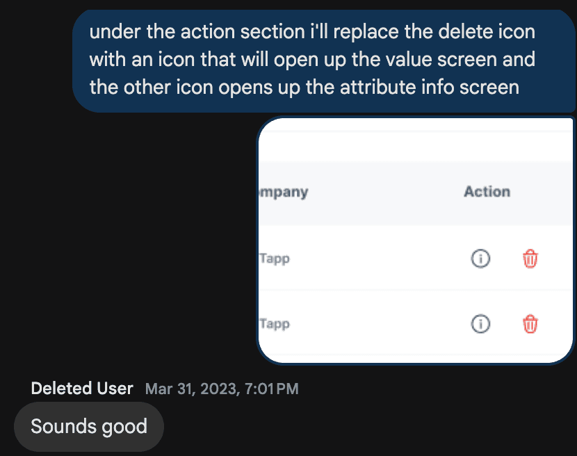
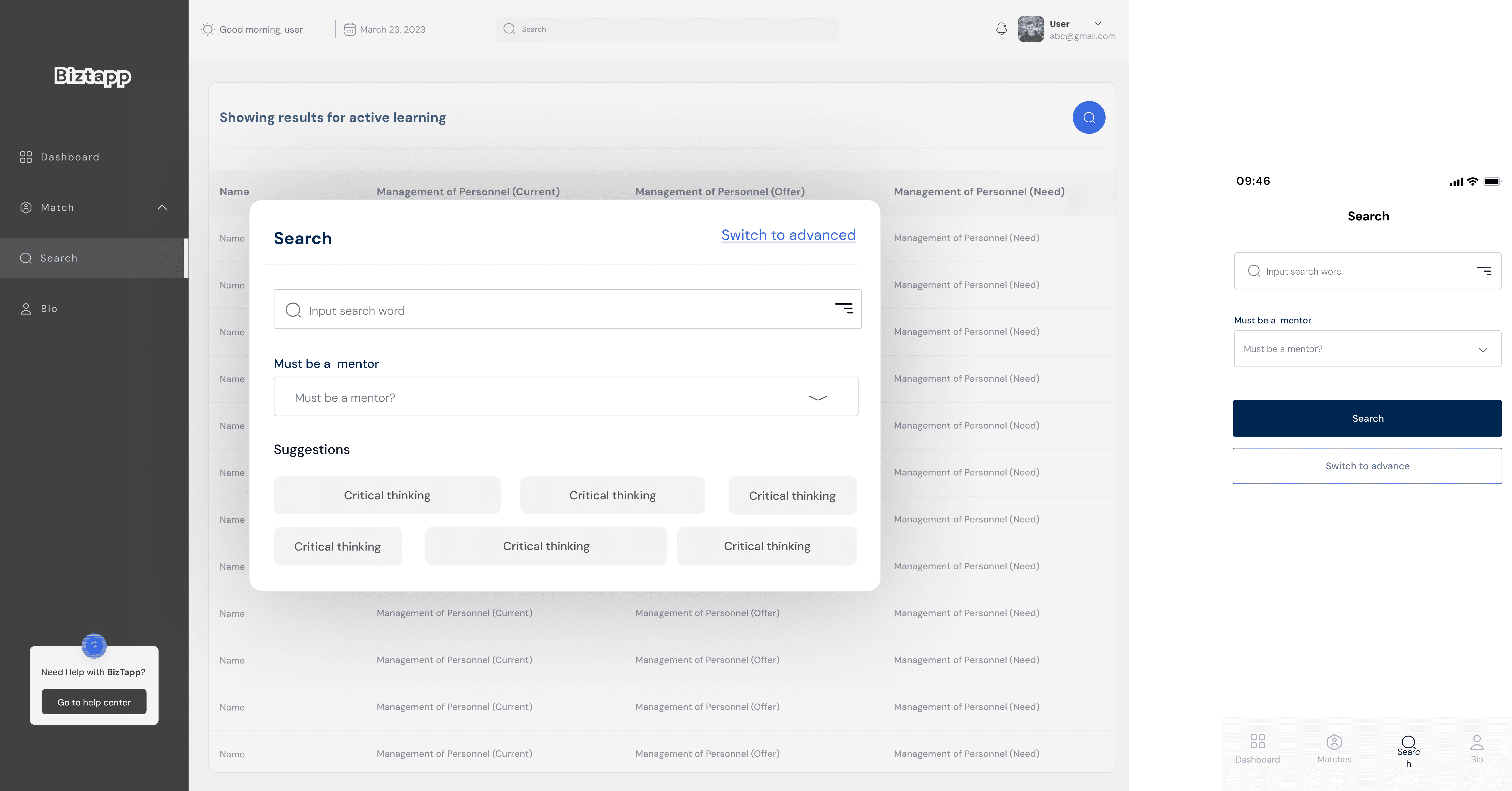
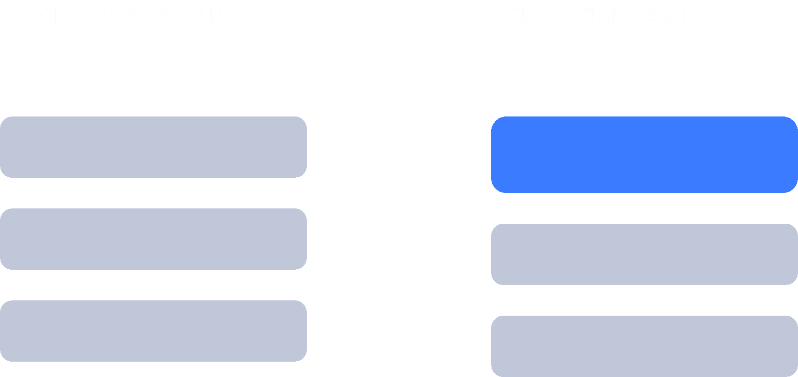
Design Execution: Rebuilding for Clarity

The redesign wasn’t just a color swap. It was a systemic refresh, Key Design Changes:

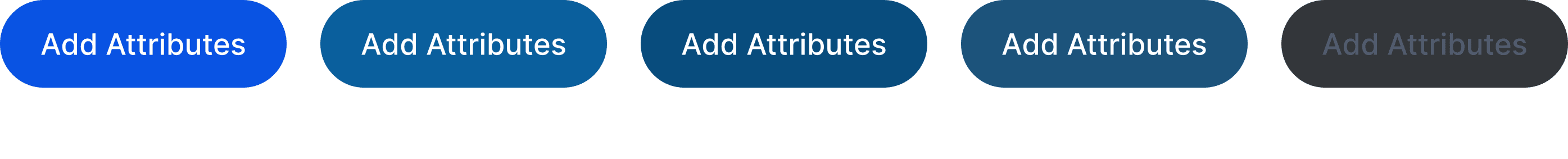
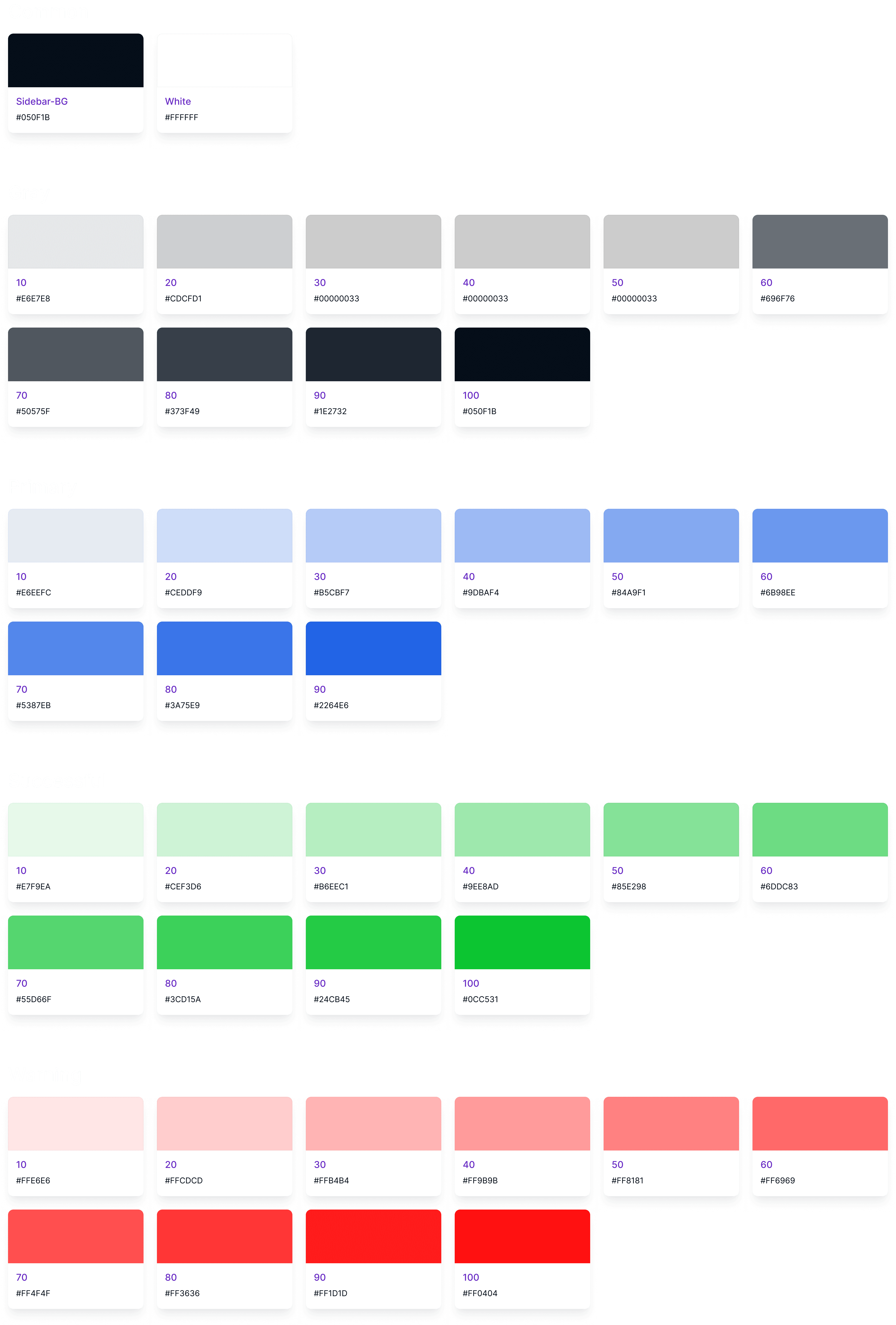
  • Primary Color Update: From dull blue (81A4C8) to vibrant azure (0953E3) for actionable components.

  • Whitespace + Typography: Improved scannability and contrast for dashboard-heavy layouts.

Before - 81A4C8

After - 0953E3

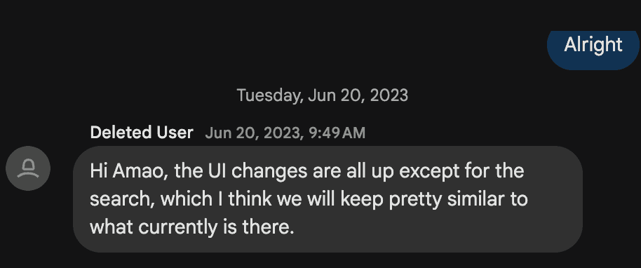
Collaboration: Bridging Design and Engineering

Every major UI change has ripple effects, To avoid friction, I partnered closely with engineering and brand teams to ensure:

  • Color style guide aligned with existing CSS variables.

  • Rollout was incremental to reduce risk.


This collaboration transformed what could have been “a design idea” into a company initiative.

Every major UI change has ripple effects, To avoid friction, I partnered closely with engineering and brand teams to ensure:

  • Color style guide aligned with existing CSS variables.

  • Rollout was incremental to reduce risk.

This collaboration transformed what could have been “a design idea” into a company initiative.

Screenshot from my constant iteration communication to the frontend engineer

Screenshot from my constant iteration communication to the frontend engineer

New color style

New color style

Screenshot from my constant iteration communication to the frontend engineer

Screenshot from my constant iteration communication to the frontend engineer

Testing — Proving Design with Data

To validate the impact, I first prototyped the new interface and then ran a 30-day A/B test comparing it with the existing design

Product performance improvement

Product performance improvement

Users found key actions faster.
The brighter blue guided focus subconsciously — clicks clustered around CTAs, and task abandonment dropped significantly.

Rollout — From Experiment to Identity

After the successful test, we rolled out the redesign company-wide in phases:

  1. Admin Dashboard.

  2. Entire user-facing ecosystem.


The result? A cohesive ecosystem with consistent, accessible design language, all built from a color change that started as a hunch.

Rollout dates

Rollout dates

Business Impact — More Than Just Pixels

The redesign yielded measurable business outcomes:

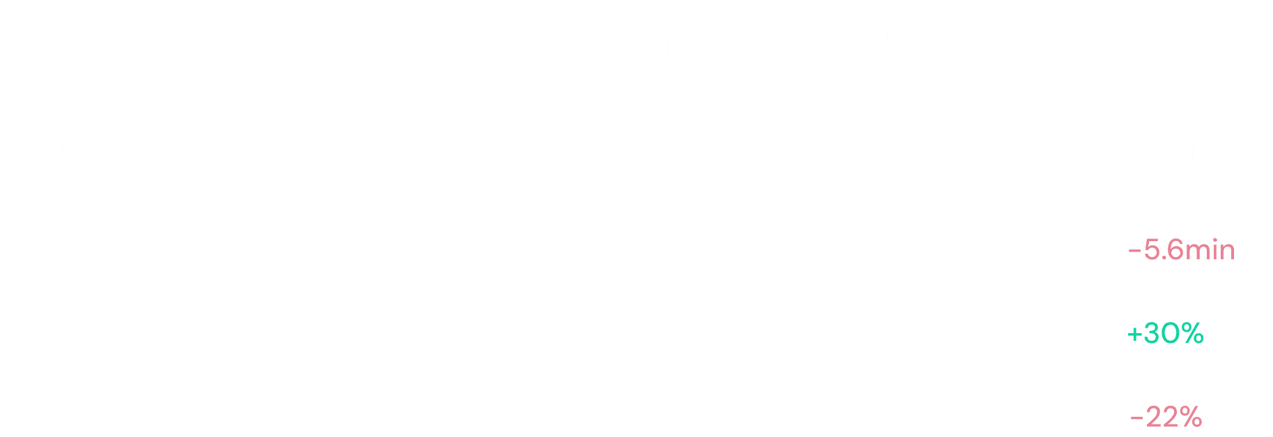
  • Retention improved by +30%.

  • Support requests fell 16%.

  • User confidence scores (via NPS verbatims) increased 18%.


But the most powerful shift was internal, design began influencing business decisions, not just screen aesthetics.

Metrics dashboard coparison

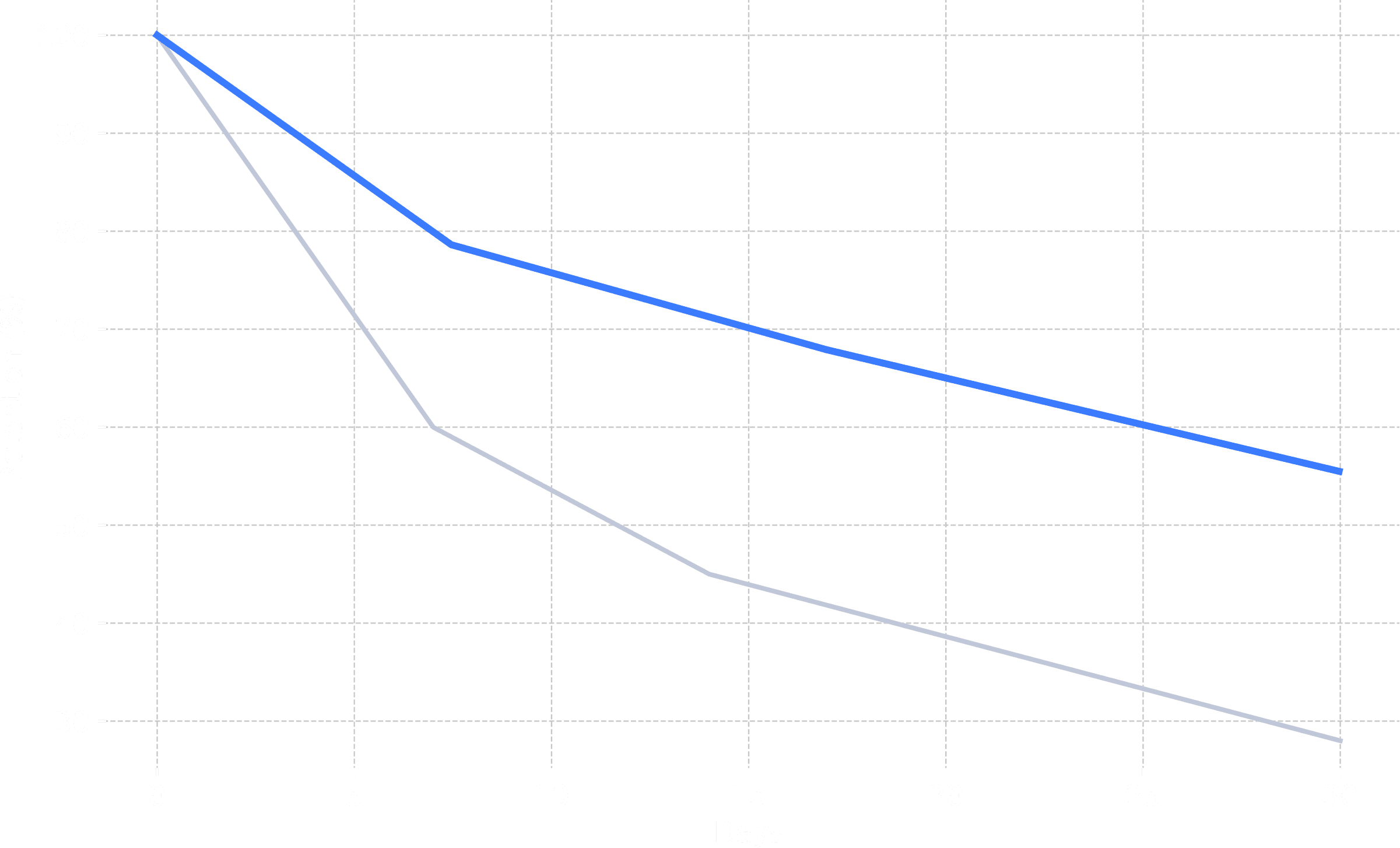
Retention curve improvement (+30%)

Screenshot from my constant iteration communication to the frontend engineer

Screenshot from my constant iteration communication to the frontend engineer

Screenshot from my constant iteration communication to the frontend engineer

Screenshot from my constant iteration communication to the frontend engineer

Reflection — What I Learned as a UX Designer

Every project changes how you design, This one changed how I lead design, Key takeaways:

  • Listen deeply before proposing solutions — users often tell you what metrics can’t.

  • Design is data storytelling. Stakeholders align when you speak their language.

  • Clarity is loyalty. The faster users understand your product, the longer they stay.

  • A single change can shift company culture. What started as a color update evolved into a design system overhaul.


“When users can see clearly, they stay longer, not because it’s easier, but because it feels right.”

Closing Thoughts

The Biztapp redesign wasn’t about color, it was about communication.
Every decision, from hue to hierarchy, was rooted in empathy and evidence.

It proved that design can drive emotion, emotion drives behavior, and behavior drives business growth, and that’s what great UX truly means.

Product designer

Motion designer

Low-code developer

AVAILALE FOR FULL TIME ROLES, FREELANCE PROJECTS

© 2025

Built in Framer with ❤️ by me

Product designer

Motion designer

Low-code developer

AVAILALE FOR FULL TIME ROLES, FREELANCE PROJECTS

© 2025

Built in Framer with ❤️ by me

Product designer

Motion designer

Low-code developer

AVAILALE FOR FULL TIME ROLES, FREELANCE PROJECTS

© 2025

Built in Framer with ❤️ by me

Create a free website with Framer, the website builder loved by startups, designers and agencies.